Picture. A scoring model assigns each case a real-valued score \(S\). For binary targets (negative \(0\), positive \(1\)), imagine drawing one truly positive and one truly negative at random and asking whether the model ranks the positive higher. The probability of that event is the area under the ROC curve (AUC). This post motivates the statement, derives it cleanly (including ties), and provides Python to generate figures that make the idea tangible.
1. Motivation:
Picture a threshold sweeping along a line. Scores live on the line. Let \(F_0\) and \(F_1\) denote the class-conditional CDFs of \(S\) under negatives and positives; \(f_0\), \(f_1\) are their densities where they exist. Sweep a threshold \(t\) from \(+\infty\) to \(-\infty\), predicting “positive” when \(S>t\). The false-positive and true-positive rates are
\[ \mathrm{FPR}(t)=\Pr(S>t\mid 0)=1-F_0(t),\qquad \mathrm{TPR}(t)=\Pr(S>t\mid 1)=1-F_1(t). \]Plotting \(\mathrm{TPR}\) against \(\mathrm{FPR}\) as \(t\) varies yields the receiver operating characteristic (ROC) curve. Its area is AUC.
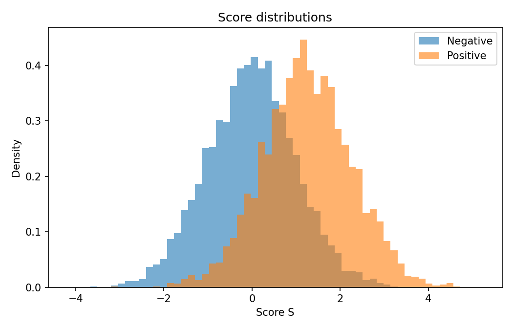
Figure 1 — code: simulate two overlapping classes and show score distributions
  # Figure 1: Score distributions (negatives vs positives)
  # Save as: assets/img/auc/distributions.png
  import os, numpy as np, matplotlib.pyplot as plt
  os.makedirs("assets/img/auc", exist_ok=True)

  rng = np.random.default_rng(42)
  neg = rng.normal(0.0, 1.0, 4000)
  pos = rng.normal(1.25, 1.0, 4000)

  bins = np.linspace(min(neg.min(), pos.min()) - 0.5,
                     max(neg.max(), pos.max()) + 0.5, 60)

  plt.figure(figsize=(7, 4.5))
  plt.hist(neg, bins=bins, alpha=0.6, density=True, label="Negative")
  plt.hist(pos, bins=bins, alpha=0.6, density=True, label="Positive")
  plt.xlabel("Score S"); plt.ylabel("Density")
  plt.title("Score distributions")
  plt.legend(); plt.tight_layout()
  plt.savefig("assets/img/auc/distributions.png", dpi=150); plt.close()
2. Thesis:
AUC equals the probability that a randomly chosen positive receives a higher score than a randomly chosen negative. With independent scores \(S_1\sim f_1\) (positive) and \(S_0\sim f_0\):
\[ \boxed{\ \mathrm{AUC}=\Pr(S_1>S_0)\ +\ \tfrac{1}{2}\Pr(S_1=S_0)\ }. \]This is the Wilcoxon–Mann–Whitney (WMW) view of AUC. It explains key invariances immediately: AUC measures ranking (discrimination), not calibration; it is unchanged by any strictly increasing transformation of the scores and by prior-probability shifts.
3. Derivation:
Start from the geometric definition:
\[ \mathrm{AUC}=\int_{0}^{1} y(x)\,dx,\quad x(t)=1-F_0(t),\ \ y(t)=1-F_1(t). \]Use a Stieltjes integral to cover continuous, discrete, and mixed cases:
\[ \mathrm{AUC}=\int_{-\infty}^{+\infty}\big[1-F_1(t)\big]\,dF_0(t) =\mathbb{E}_{S_0\sim F_0}\!\big[1-F_1(S_0)\big]. \]Since \(1-F_1(s)=\Pr(S_1>s)\), taking expectation over \(S_0\) yields
\[ \mathrm{AUC}=\Pr(S_1>S_0)\ +\ \tfrac{1}{2}\Pr(S_1=S_0), \]where the \(\tfrac{1}{2}\) term accounts for ties. In the continuous case, \(\Pr(S_1=S_0)=0\) and the familiar \(\Pr(S_1>S_0)\) remains.
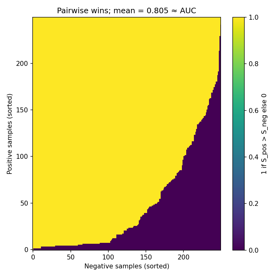
Figure 2 — code: visualize AUC as pairwise wins (positives vs negatives)
  # Figure 2: Pairwise wins matrix; mean ≈ AUC (with half-credit for ties)
  # Save as: assets/img/auc/pairwise_matrix.png
  import os, numpy as np, matplotlib.pyplot as plt
  os.makedirs("assets/img/auc", exist_ok=True)

  rng = np.random.default_rng(0)
  neg = np.sort(rng.normal(0.0, 1.0, 250))
  pos = np.sort(rng.normal(1.25, 1.0, 250))

  # Quantize to induce some ties (for visibility)
  neg_q = np.round(neg, 1)
  pos_q = np.round(pos, 1)

  M = (pos_q[:, None] > neg_q[None, :]).astype(float) + 0.5*(pos_q[:, None] == neg_q[None, :])

  plt.figure(figsize=(6, 6))
  plt.imshow(M, aspect="auto", origin="lower", interpolation="nearest")
  plt.colorbar(label="1 if S_pos > S_neg; 0.5 if tie; 0 otherwise")
  plt.xlabel("Negative samples (sorted)"); plt.ylabel("Positive samples (sorted)")
  plt.title(f"Pairwise wins; mean = {M.mean():.3f} ≈ AUC")
  plt.tight_layout(); plt.savefig("assets/img/auc/pairwise_matrix.png", dpi=150); plt.close()
4. Reading the ROC like a map
Differentiate the parametric form (where densities exist): \(dx/dt=-f_0(t)\) and \(dy/dt=-f_1(t)\). The instantaneous slope is the likelihood ratio at threshold \(t\):
\[ \frac{dy}{dx}=\frac{f_1(t)}{f_0(t)}. \]Where the curve is steep, small relaxations of the threshold buy many true positives per false positive—this is the Neyman–Pearson lens, in geometry.
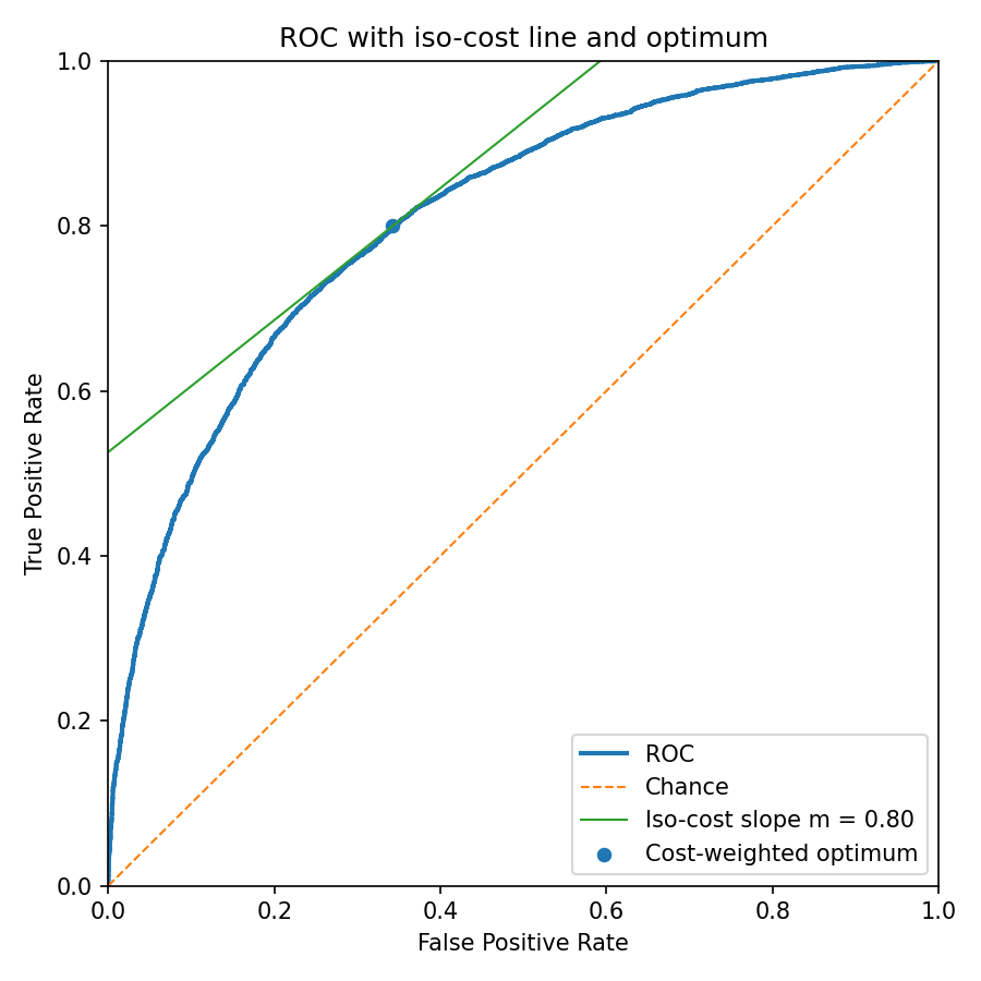
Iso-cost lines and the optimal operating point. If the positive prevalence is \(\pi_1\) (so \(\pi_0=1-\pi_1\)) and the false-negative/false-positive costs are \(c_{10}\) and \(c_{01}\), then lines of equal expected cost in ROC space have slope
\[ m=\frac{\pi_0\,c_{01}}{\pi_1\,c_{10}}. \]The Bayes-optimal threshold is where the ROC’s tangent has slope \(m\): \(f_1(t)/f_0(t)=m\).
Figure 3 — code: empirical ROC and a numerical tangent (slope ≈ likelihood ratio)
  # Figure 3: Empirical ROC with a local tangent (slope ≈ likelihood ratio)
  # Save as: assets/img/auc/roc_curve.png
  import os, numpy as np, matplotlib.pyplot as plt
  os.makedirs("assets/img/auc", exist_ok=True)

  rng = np.random.default_rng(1)
  neg = rng.normal(0.0, 1.0, 4000); pos = rng.normal(1.25, 1.0, 4000)
  scores = np.concatenate([neg, pos])
  ytrue  = np.concatenate([np.zeros_like(neg, dtype=int), np.ones_like(pos, dtype=int)])

  # Minimal ROC from scratch
  order = np.argsort(-scores, kind="mergesort")
  y = ytrue[order]
  P = y.sum(); N = len(y) - P
  tps = np.cumsum(y); fps = np.cumsum(1 - y)
  tpr = np.concatenate(([0.0], tps / P, [1.0]))
  fpr = np.concatenate(([0.0], fps / N, [1.0]))

  # Pick a point near FPR≈0.2 and estimate slope numerically
  idx = np.argmin(np.abs(fpr - 0.2))
  x0, y0 = fpr[idx], tpr[idx]
  i1 = max(1, idx - 3); i2 = min(len(fpr) - 2, idx + 3)
  slope = (tpr[i2] - tpr[i1]) / (fpr[i2] - fpr[i1])

  plt.figure(figsize=(6, 6))
  plt.plot(fpr, tpr, lw=2, label="ROC")
  plt.plot([0, 1], [0, 1], "--", lw=1, label="Chance")
  x = np.array([x0 - 0.15, x0 + 0.15]); yline = y0 + slope * (x - x0)
  plt.plot(x, yline, lw=1, label=f"Tangent slope ≈ {slope:.2f}")
  plt.scatter([x0], [y0], s=30)
  plt.xlim(0, 1); plt.ylim(0, 1)
  plt.xlabel("False Positive Rate"); plt.ylabel("True Positive Rate")
  plt.title("ROC and local slope (likelihood ratio)")
  plt.legend(); plt.tight_layout()
  plt.savefig("assets/img/auc/roc_curve.png", dpi=150); plt.close()
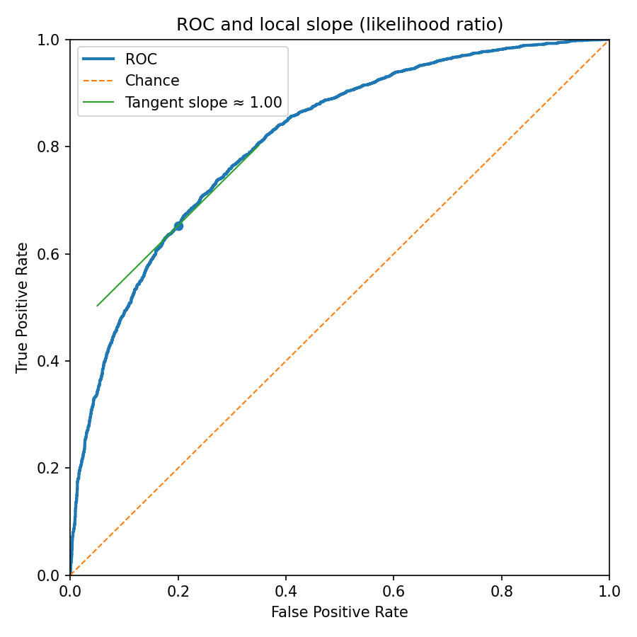
Figure 4 — code: iso-cost geometry and cost-weighted operating point
  # Figure 4: ROC with iso-cost line and cost-weighted optimum (slope m)
  # Save as: assets/img/auc/iso_cost.png
  import os, numpy as np, matplotlib.pyplot as plt
  os.makedirs("assets/img/auc", exist_ok=True)

  rng = np.random.default_rng(2)
  neg = rng.normal(0.0, 1.0, 6000); pos = rng.normal(1.25, 1.0, 6000)
  scores = np.concatenate([neg, pos])
  ytrue  = np.concatenate([np.zeros_like(neg, dtype=int), np.ones_like(pos, dtype=int)])

  # ROC
  order = np.argsort(-scores, kind="mergesort")
  y = ytrue[order]
  P = y.sum(); N = len(y) - P
  tps = np.cumsum(y); fps = np.cumsum(1 - y)
  tpr = np.concatenate(([0.0], tps / P, [1.0]))
  fpr = np.concatenate(([0.0], fps / N, [1.0]))

  # Iso-cost slope m = (pi0*c01)/(pi1*c10)
  pi1 = 0.2; pi0 = 1 - pi1; c10 = 5.0; c01 = 1.0
  m = (pi0 * c01) / (pi1 * c10)

  # Cost-weighted Youden index: maximize TPR - m*FPR
  idx = np.argmax(tpr - m * fpr)
  x0, y0 = fpr[idx], tpr[idx]

  # Iso-cost line through (x0, y0)
  x = np.array([0.0, 1.0]); y = y0 + m * (x - x0)

  plt.figure(figsize=(6, 6))
  plt.plot(fpr, tpr, lw=2, label="ROC")
  plt.plot([0, 1], [0, 1], "--", lw=1, label="Chance")
  plt.plot(x, y, lw=1, label=f"Iso-cost slope m = {m:.2f}")
  plt.scatter([x0], [y0], s=30, label="Cost-weighted optimum")
  plt.xlim(0, 1); plt.ylim(0, 1)
  plt.xlabel("False Positive Rate"); plt.ylabel("True Positive Rate")
  plt.title("ROC with iso-cost line and optimum")
  plt.legend(); plt.tight_layout()
  plt.savefig("assets/img/auc/iso_cost.png", dpi=150); plt.close()
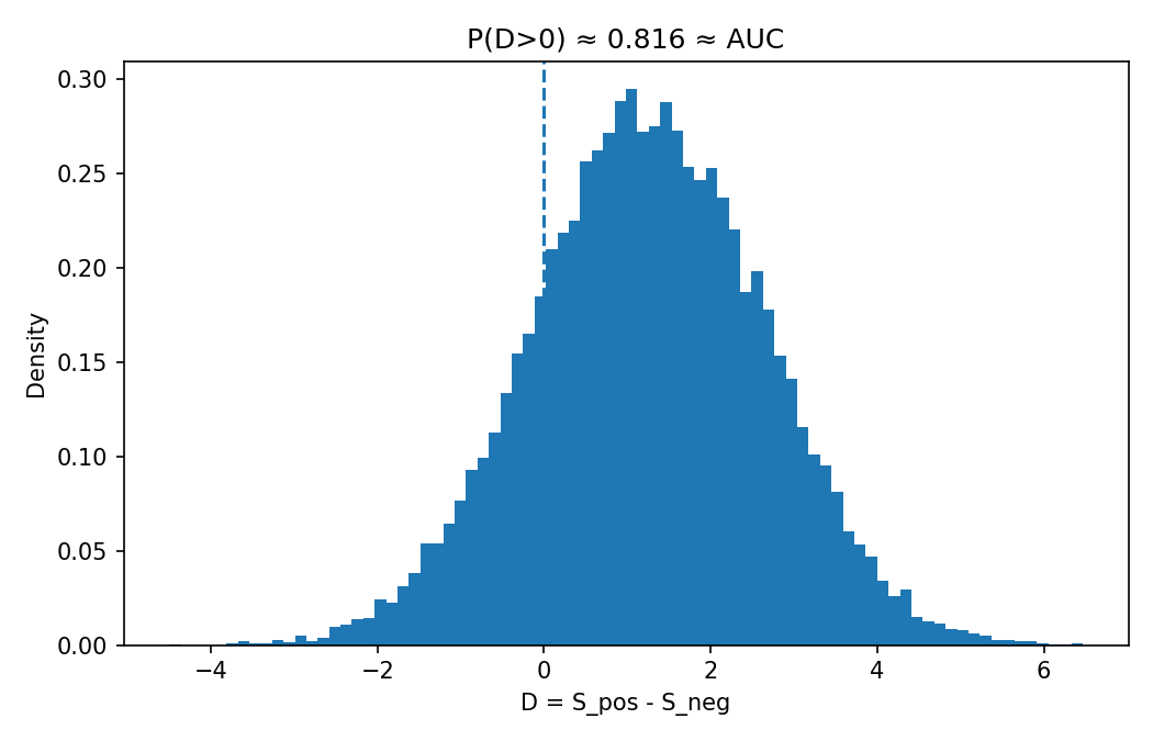
5. Three equivalent pictures of AUC
- Integral under trade-off: \(\displaystyle \mathrm{AUC}=\int_0^1 \mathrm{TPR}(x)\,dx\).
- Pairwise probability: \(\mathrm{AUC}=\Pr(S_1>S_0)+\tfrac{1}{2}\Pr(S_1=S_0)\).
- Difference distribution: Let \(D=S_1-S_0\); then \(\mathrm{AUC}=\Pr(D>0)+\tfrac{1}{2}\Pr(D=0)\).
AUC equals Harrell’s c-index for binary outcomes; in survival settings, c adapts to censoring.
Figure 5 — code: difference distribution; area right of 0 equals AUC
  # Figure 5: Distribution of differences D = S_pos - S_neg
  # Save as: assets/img/auc/difference_distribution.png
  import os, numpy as np, matplotlib.pyplot as plt
  os.makedirs("assets/img/auc", exist_ok=True)

  rng = np.random.default_rng(7)
  neg = rng.normal(0.0, 1.0, 10000)
  pos = rng.normal(1.25, 1.0, 10000)
  d = rng.choice(pos, 20000) - rng.choice(neg, 20000)

  plt.figure(figsize=(7, 4.5))
  plt.hist(d, bins=80, density=True)
  plt.axvline(0.0, linestyle="--")
  plt.xlabel("D = S_pos - S_neg"); plt.ylabel("Density")
  plt.title(f"P(D>0) ≈ {np.mean(d>0):.3f} ≈ AUC")
  plt.tight_layout(); plt.savefig("assets/img/auc/difference_distribution.png", dpi=150); plt.close()
6. Practicalities in one place
- Empirical AUC is pair counting (a WMW \(U\)-statistic). With \(m\) positives and \(n\) negatives, average \(\mathbf{1}\{s_{1,i}>s_{0,j}\}\) over all \(mn\) cross-pairs; give ties half-credit. DeLong’s method gives a nonparametric variance and tests for comparing ROCs.
- Prevalence-free and rank-only. AUC conditions on class and depends only on the order of scores; it is invariant to any strictly increasing score transform and to prior shifts.
- Threshold choice is contextual. The optimal point depends on prevalence and costs: pick the tangent where \(f_1/f_0=(\pi_0 c_{01})/(\pi_1 c_{10})\) (Section 4).
- ROC vs PR. Under extreme imbalance, precision–recall (PR) curves often communicate utility more directly; PR focuses on the positive class and depends on prevalence. AUC remains well-defined but can overstate performance in rare-positive regimes.
- Gini. The credit-scoring Gini is \(G=2\mathrm{AUC}-1\).
- Multiclass. Common practice is one-vs-rest or one-vs-one macro-averaging; interpretability follows the binary case but the meaning of a single scalar “AUC” is aggregation-dependent.
Minimal ROC/AUC — code
  # Minimal ROC/AUC from scores and labels
  # Usage: fpr, tpr, auc = roc_auc(y_true, y_score)
  import numpy as np

  def roc_auc(y_true, y_score):
      y_true = np.asarray(y_true).astype(int)
      y_score = np.asarray(y_score).astype(float)
      order = np.argsort(-y_score, kind="mergesort")
      y = y_true[order]
      P = y.sum(); N = len(y) - P
      tps = np.cumsum(y); fps = np.cumsum(1 - y)
      tpr = np.concatenate(([0.0], tps / P, [1.0]))
      fpr = np.concatenate(([0.0], fps / N, [1.0]))
      auc = np.trapz(tpr, fpr)
      return fpr, tpr, auc
AUC via WMW pair counting — code
  # AUC via explicit pair counting (with half-credit for ties)
  # Works for small/medium data; O(m*n) memory if you materialize the matrix.
  import numpy as np

  def auc_paircount(y_true, y_score):
      y_true = np.asarray(y_true).astype(int)
      y_score = np.asarray(y_score).astype(float)
      pos = y_score[y_true == 1]
      neg = y_score[y_true == 0]
      if len(pos) == 0 or len(neg) == 0:
          raise ValueError("Both classes must be present.")
      # Broadcasting comparison; add 0.5 for ties.
      wins = (pos[:, None] > neg[None, :]).sum()
      ties = (pos[:, None] == neg[None, :]).sum()
      return (wins + 0.5 * ties) / (len(pos) * len(neg))
If you want a library call, see scikit-learn’s roc_curve and roc_auc_score.
Four orthogonal problems
- Foundations (measure/Stieltjes): the tie term. Starting from \[ \mathrm{AUC}=\int_{\mathbb{R}} (1-F_1)\,dF_0 \] (Riemann–Stieltjes with the trapezoidal convention), prove \[ \mathrm{AUC}=\Pr(S_1>S_0)+\tfrac{1}{2}\Pr(S_1=S_0) \] without assuming densities, and make explicit where the \(\tfrac12\) comes from.
- Geometry/decision theory: Bayes operating point from ROC slope. With prevalence \(\pi\in(0,1)\) and costs \(C_{10}\) (FP), \(C_{01}\) (FN), show that the Bayes‑optimal threshold \(t^\star\) occurs where the ROC’s tangent slope equals \[ m^\star=\frac{C_{10}(1-\pi)}{C_{01}\pi}. \] Then, for the equal‑variance binormal model \(S\mid Y=i\sim\mathcal{N}(\mu_i,\sigma^2)\), derive \[ t^\star=\frac{\mu_0+\mu_1}{2}+\frac{\sigma^2}{\mu_1-\mu_0}\,\ln\!\frac{(1-\pi)C_{10}}{\pi C_{01}}, \] and verify that the ROC slope at \(t^\star\) equals \(m^\star\).
- Asymptotics/U‑statistics: variance of empirical AUC. Let \(\widehat{\mathrm{AUC}}\) be the empirical AUC computed on \(m\) positives and \(n\) negatives using the kernel \[ h(s_1,s_0)=\mathbf{1}\{s_1>s_0\}+\tfrac12\mathbf{1}\{s_1=s_0\}. \] Show unbiasedness and derive its asymptotic variance in terms of \(\operatorname{Var}(\mathbb{E}[h\mid S_1])\) and \(\operatorname{Var}(\mathbb{E}[h\mid S_0])\). State clear regularity conditions.
- Distribution shift: AUC invariance under covariate/prevalence shift; PR sensitivity. Suppose the model’s conditional score laws \(F_0,F_1\) are unchanged across domains but the class prior changes from \(\pi\) to \(\pi'\) (\(\pi\neq\pi'\)). Prove that the ROC/AUC is invariant while precision–recall (and AUPRC) can change. Give a concrete numeric example at a fixed threshold to illustrate the magnitude of the precision change.
Solutions (click to expand)
- Foundations (measure/Stieltjes): the tie term.
Goal. From \(\displaystyle \mathrm{AUC}=\int (1-F_1)\,dF_0\) show \(\mathrm{AUC}=\Pr(S_1>S_0)+\tfrac12\Pr(S_1=S_0)\).
Step 1 (integration by parts with the trapezoidal convention). For càdlàg \(F_0,F_1\), Young’s (symmetric) Stieltjes integration by parts gives \[ \int (1-F_1)\,dF_0-\int F_0\,dF_1 \;=\; \underbrace{[(1\!-\!F_1)F_0]_{-\infty}^{+\infty}}_{=\,0} \;-\;\tfrac12 \sum_{t\in\mathbb{R}} \Delta F_1(t)\,\Delta F_0(t), \] where \(\Delta F_i(t)=F_i(t)-F_i(t^-)=\Pr(S_i=t)\). Hence \[ \int (1-F_1)\,dF_0 \;=\; \int F_0\,dF_1 \;-\;\tfrac12 \sum_t \Delta F_1(t)\,\Delta F_0(t). \]
Step 2 (identify the two terms probabilistically). By the Lebesgue–Stieltjes identity, \[ \int F_0\,dF_1=\mathbb{E}[F_0(S_1)] =\mathbb{E}\big[\Pr(S_0\le S_1\mid S_1)\big] =\Pr(S_0\le S_1)=\Pr(S_1\ge S_0). \] Independence of \(S_1\) and \(S_0\) gives \(\sum_t \Delta F_1(t)\Delta F_0(t)=\Pr(S_1=S_0)\). Therefore \[ \int (1-F_1)\,dF_0 \;=\; \Pr(S_1\ge S_0)\;-\;\tfrac12\,\Pr(S_1=S_0) \;=\; \Pr(S_1>S_0)+\tfrac12\,\Pr(S_1=S_0). \] The factor \(\tfrac12\) is exactly the cross‑jump term coming from the trapezoidal (midpoint) Stieltjes convention; geometrically it is the area contributed by vertical steps of the ROC when both classes have an atom at the same score.
- Geometry/decision theory: Bayes operating point from ROC slope.
Risk as a function of threshold. Predict \(1\) when \(S>t\). Expected cost \[ R(t)=C_{01}\,\pi\,F_1(t)+C_{10}\,(1-\pi)\,[1-F_0(t)] =C_{01}\pi\,\big(1-\mathrm{TPR}(t)\big) +C_{10}(1-\pi)\,\mathrm{FPR}(t). \]
First‑order condition. When densities exist at \(t\), \(R'(t)=C_{01}\pi\,f_1(t)-C_{10}(1-\pi)\,f_0(t)\). Setting \(R'(t^\star)=0\) yields \[ \frac{f_1(t^\star)}{f_0(t^\star)}=\frac{C_{10}(1-\pi)}{C_{01}\pi}\;=:\;m^\star. \] But the ROC parameterization by threshold gives \(\dfrac{d\,\mathrm{TPR}(t)}{d\,\mathrm{FPR}(t)} =\dfrac{-f_1(t)}{-f_0(t)}=\dfrac{f_1(t)}{f_0(t)}\). Hence the Bayes point occurs where the ROC’s tangent slope equals \(m^\star\).
Equal‑variance Gaussians. If \(S\mid Y=i\sim\mathcal{N}(\mu_i,\sigma^2)\), \[ \log\frac{f_1(t)}{f_0(t)} =\frac{\mu_1-\mu_0}{\sigma^2}\Big(t-\frac{\mu_0+\mu_1}{2}\Big). \] Solving \(\frac{f_1(t^\star)}{f_0(t^\star)}=m^\star\) gives \[ t^\star=\frac{\mu_0+\mu_1}{2}+\frac{\sigma^2}{\mu_1-\mu_0}\,\ln m^\star =\frac{\mu_0+\mu_1}{2}+\frac{\sigma^2}{\mu_1-\mu_0}\, \ln\!\frac{(1-\pi)C_{10}}{\pi C_{01}}. \] Substituting \(t^\star\) back into \(f_1/f_0\) recovers \(m^\star\), verifying the slope condition at the optimum.
- Asymptotics/U‑statistics: variance of empirical AUC.
Estimator and unbiasedness. With \(\{S_{1i}\}_{i=1}^m\overset{\text{i.i.d.}}{\sim}F_1\), \(\{S_{0j}\}_{j=1}^n\overset{\text{i.i.d.}}{\sim}F_0\), independent, \[ \widehat{\mathrm{AUC}} =\frac{1}{mn}\sum_{i=1}^m\sum_{j=1}^n h(S_{1i},S_{0j}), \quad h(s_1,s_0)=\mathbf{1}\{s_1>s_0\}+\tfrac12\mathbf{1}\{s_1=s_0\}. \] Then \(\mathbb{E}[\widehat{\mathrm{AUC}}] =\mathbb{E}[h(S_1,S_0)]=\mathrm{AUC}\) by independence, so the estimator is unbiased.
Hoeffding decomposition. Define \[ \psi_1(s):=\mathbb{E}[h(s,S_0)] =\Pr(S_0
Asymptotic variance and CLT. With \(\sigma_1^2:=\operatorname{Var}(\psi_1(S_1))\), \(\sigma_0^2:=\operatorname{Var}(\psi_0(S_0))\), \[ \operatorname{Var}(\widehat{\mathrm{AUC}}) =\frac{\sigma_1^2}{m}+\frac{\sigma_0^2}{n}+o\!\Big(\frac{1}{m}+\frac{1}{n}\Big). \] If \(m,n\to\infty\) with \(m/(m+n)\to\lambda\in(0,1)\), \[ \sqrt{\frac{mn}{m+n}}\big(\widehat{\mathrm{AUC}}-\theta\big) \;\xrightarrow{d}\; \mathcal{N}\!\big(0,\,(1-\lambda)\sigma_1^2+\lambda\sigma_0^2\big). \]
Regularity. i.i.d. within class and independence across classes; \(h\) bounded (here in \([0,1]\)), ensuring Lindeberg; \(\sigma_1^2+\sigma_0^2>0\) (i.e., non‑degenerate, excluding perfect separation).
- Distribution shift: AUC invariance; PR sensitivity.
Claim. If the conditional score laws \(F_0,F_1\) are identical across domains, then the entire ROC and its area are invariant to changes in \(\pi\) or in the covariate distribution \(p(x)\) that leave \(F_i\) unchanged, while PR depends on \(\pi\).
Proof (ROC/AUC). For any threshold \(t\), \(\mathrm{TPR}(t)=1-F_1(t)\) and \(\mathrm{FPR}(t)=1-F_0(t)\) depend only on \(F_1,F_0\), not on \(\pi\). Therefore the parametric curve \(\{(\mathrm{FPR}(t),\mathrm{TPR}(t))\}_t\) and \(\mathrm{AUC}=\int (1-F_1)\,dF_0\) are invariant.
PR depends on \(\pi\). Precision at threshold \(t\) is \[ \mathrm{Prec}(t)=\frac{\pi\,\mathrm{TPR}(t)}{\pi\,\mathrm{TPR}(t)+(1-\pi)\,\mathrm{FPR}(t)}, \] so changing \(\pi\) alters \(\mathrm{Prec}(t)\) and hence AUPRC.
Numeric illustration. Fix \(\mathrm{TPR}=0.80\), \(\mathrm{FPR}=0.10\) at some \(t\). If \(\pi=0.50\): \(\mathrm{Prec}=0.4/(0.4+0.05)=0.888\). If \(\pi=0.10\): \(\mathrm{Prec}=0.08/(0.08+0.09)=0.471\). The ROC point is identical; precision shifts dramatically with prevalence.